
The Seoul Design Foundation's new Seoul Design Product Competition is a project to support product development and distribution market by contesting design products that enhance the dignity of Seoul. We proposed the direction of this project and expressed the leading Seoul design brand that enhances the class of citizen's lifestyle from the spatial concept of Seoul through branding work.
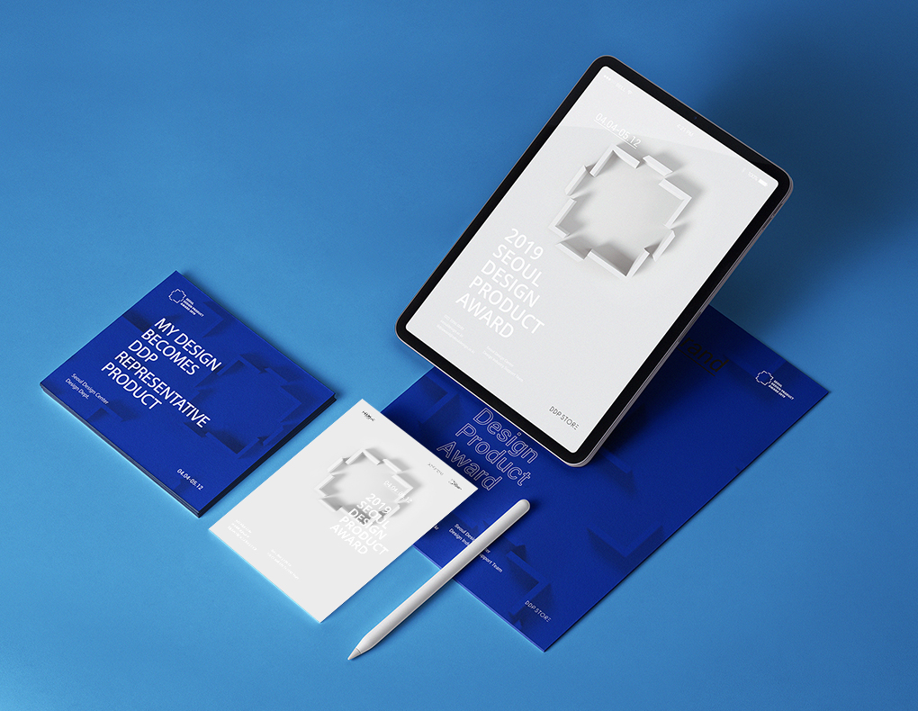
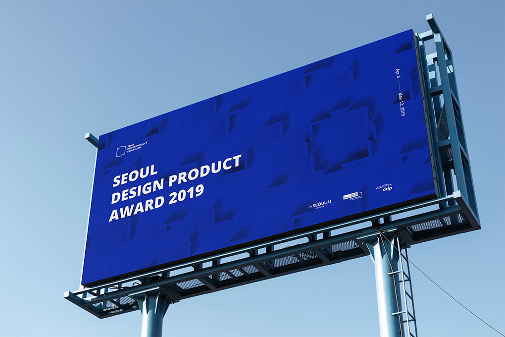
Brand identity, poster, web promotion, film
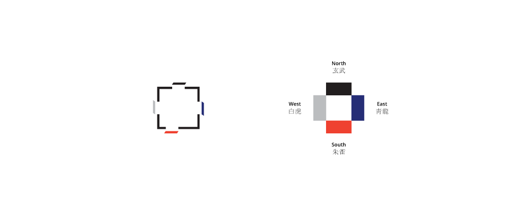
「 Shapes that are open to the north, south, east, and west of the city
symbolize autonomy, expansion, openness and integration. 」
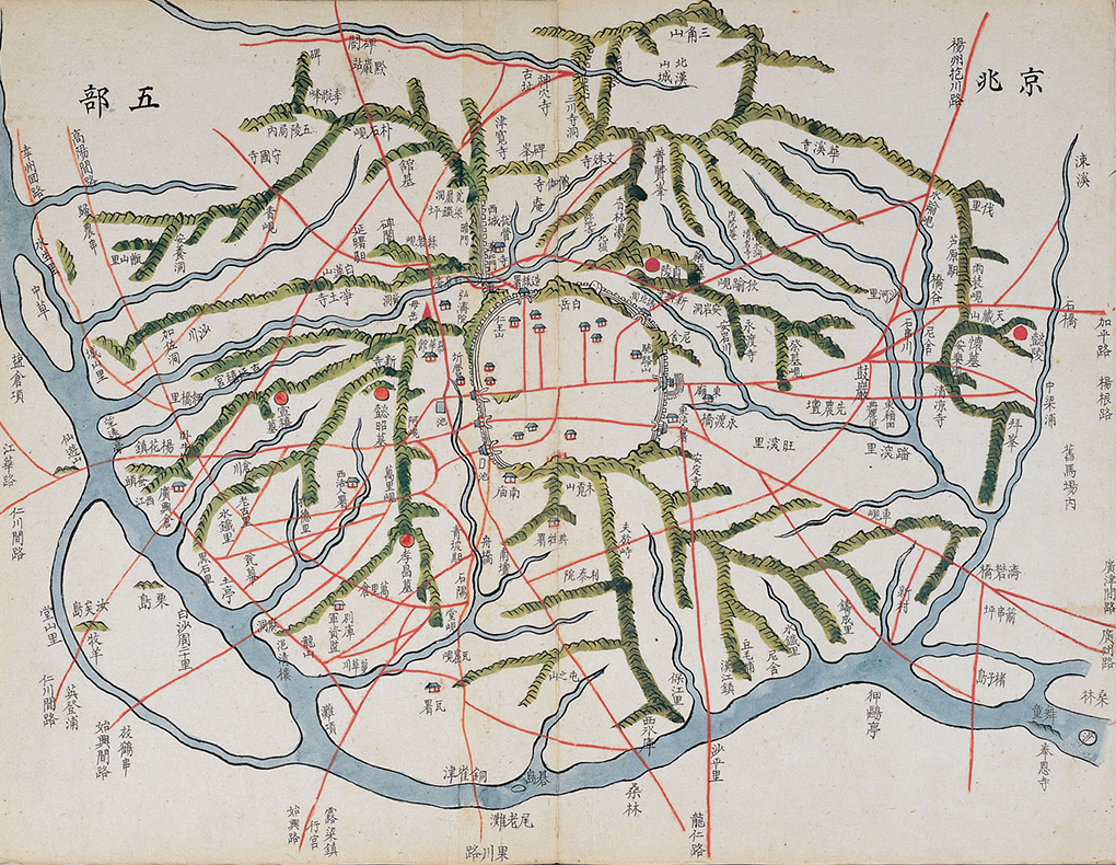
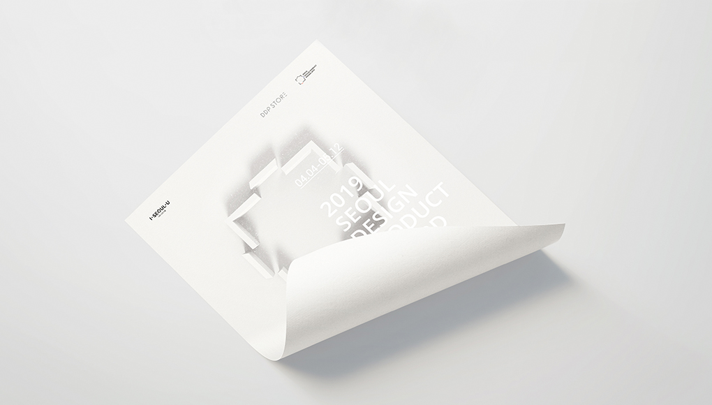
Prior to the work, I focused on the locality of Seoul. Located in the center of Seoul, Sadaemun(The four main gates of old Seoul) is a gate built around the city of Seoul in the Joseon Dynasty. Traditionally, this is the inner city of Seoul. Each of the four gates was placed at the actual location on the map, so Namdaemun(South Gate) is positioned slightly to the left.
Each door is positioned slightly off the wall to create an open image that emphasizes the characteristic of the competition to support open thinking.
Obliquely drawn Sadaemun represents the Korean perspective seen in traditional folk Korea. This technique, called the multi-view drawing technique, is used mainly in Korean folk paintings, in which draws backwards larger than the front, or behind it, so that the invisible parts are also visible.
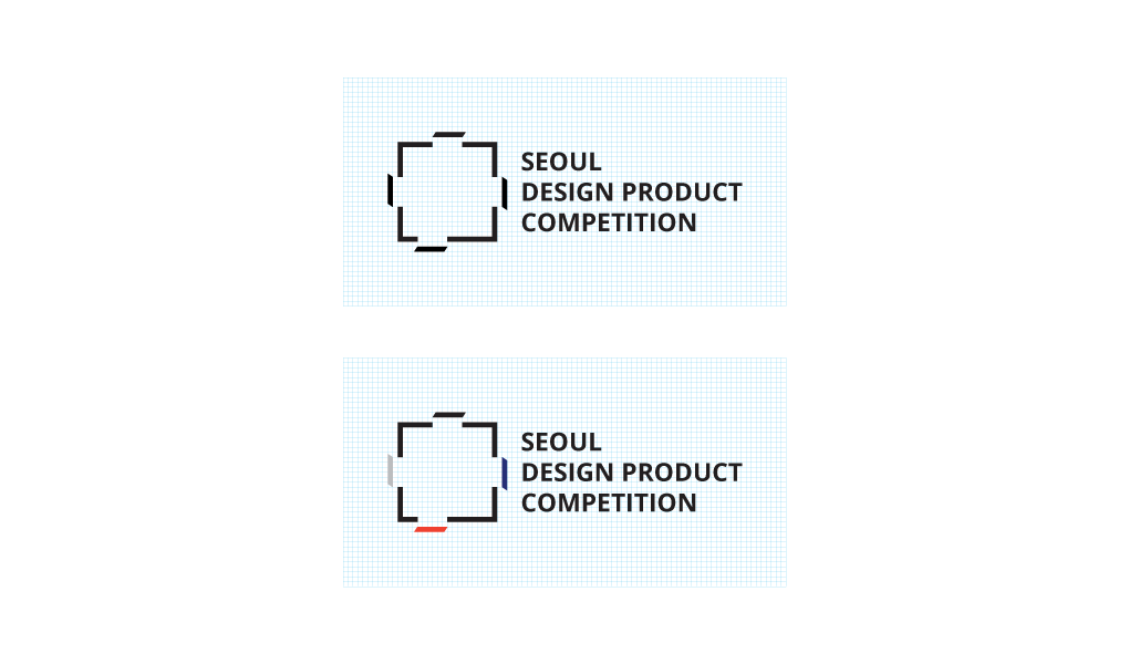
Shapes that are open to the north, south, east, and west of the city symbolize autonomy, expansion, openness and integration. Historically, it connects the past with the present. Culturally, it means opening and expanding living frame from East to West.
The colors used in the color version were the five cardinal colors corresponding to each direction. The colors symbolizing the four directions are coming from the blue of the east, passing through the northern black, through the western white, and leading to the southern red, the index of birth.
Project name Seoul Design Product Award
Date 2019
Client Seoul Design Foundation
Previous Project Najeon & Ottchil, Korean Crafts for Millennia
Next Project We Are One


